
TL; DR - Three month contract setting up UX for a social impact startup in Newark; Designed UX & Onboarding for an online learning network based on existing research and social media connections. Mentored on-site staff in production workflow. Created promotional and sponsorship materials. Contributed to training workshops and defined network as a product. Handed off to on-site team after 90 days.
In June 2017 I was approached by two graduates of Rutgers' Coding bootcamp project: they had attended some of my lectures on Experience Design and wanted my opinion on a Digital Service they were planning based in a facility in Newark, NJ which was to support the activities of a social impact startup which was attempting to deliver educational content to its private network of entrepreneurs.
I immediately took a visit to their Newark HQ and participated in a workshop around what the company saw as their product. Based on this workshop I then created a test brief, and with some extremely tight deadlines we commenced an incredibly fast build, and I had to cut every corner in terms of geting a bespoke design that was scalable delivered inside a very fast deadline.
As with many startup clients, we were very low on basic materials - branding collateral, research about the customer audience segmentation, realistic user personas; and the team I was working with were new to UCD and with low levels of publishing / media management experience.


The first thing was to create a brief and discuss the brief in-depth. Based on this brief we would then decide an SOW and a basic outline of how I was to deliver UI and site structure to the team over time. I created a PDF and the FOWNDERS team met with me to verify we were moving in the right direction.
Second step was to simultaneously start service planning with the CTO while running Stakeholder questionnaires and subsequent debriefing sessions with the team. This meant that after one week we had the parameters of the apllication planned out, the main priorities of the build and the basic collateral all in one place
Week 1 / Prototype 01: experimenting with look and feel / tone of offering
(this was a very basic layout prototype locked to 1440 wide which showed how a grid and a series of removable "news" blocks could be used to draw a user through a series of what we want them to see on first approach to the site: once the x has been used to remove all the boxes there is a *very* light demo of mouseovers)

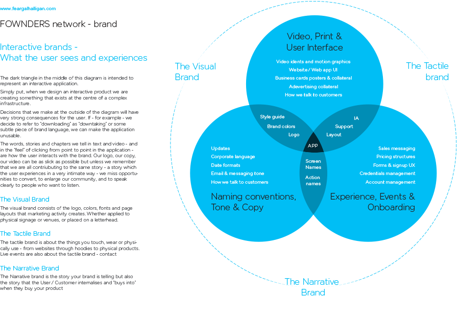
This meant we could immediately jump into the next set of tangled issues: In the first couple of days of research I created a simple set of UI mockups which experimented with the brand, brand assets and colors in ways designed to provoke conversation and get everyone focused on what we were projecting as a service and a network.
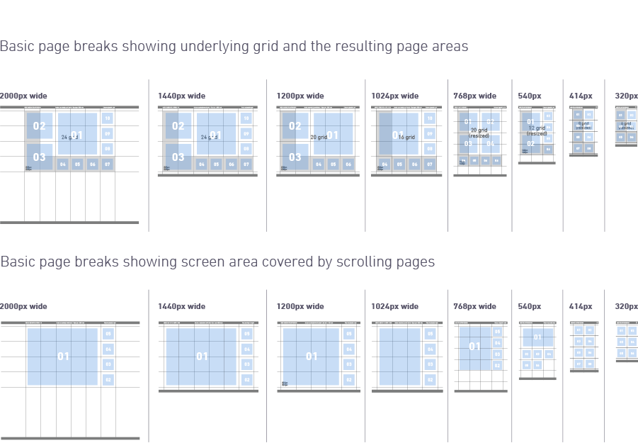
Trying to bring opinion together as to aspects of how the brand interacted with UI, I presented this grid solution which was to allow both the maximum amount of screen real estate and the maximim amount of items in view.
The grid also allowed the user to be drawn through a number of onboarding tasks by pop-up prompts.
The grid also allowed the user to be drawn through a number of onboarding tasks by pop-up prompts.
Week 2 / Prototype 02: first user journey / arriving to service via link
(this was a fairly advanced visual prototype to try and answer as many questions as possible about brownsing patterns and how we expect users to use the service / engage with the site at first)
Delivering the first visuals at the same time as the service plan and the basic user journeys mean there needed to be a lot of fast decisionmaking and education around UX principles: Analysis of what the brand is, how it works and what way we represent it to the user became a whole part of the discussion as copy (and microcopy) was written to craft the fastest and simplest onboarding possible.
This created a nice gap during which the dev team and marketing could collaborate on basic user journeys and ideas of what long term goals and requirements are as users mature in the service:

Week 3 / protoype 03: second user journey / more detail around onboarding
(This was built on top of feedback from the previous week, to provide a visual focus for the discussion of the content and publishing strategy once the service was up and running)

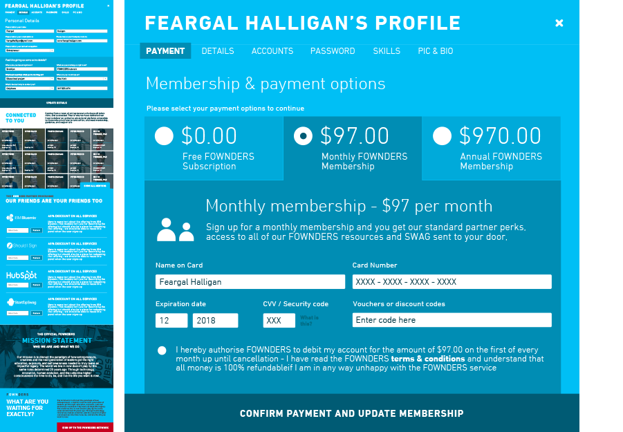
Using these in very rough discussion, we clipped the corners off the application and launched a test version after a month of planning and development, using internal staff and early adopters / enthusiastic fans as our testbed.
There were also a couple of test public events which we were able to leverage for test data from the local newark community *and* from entrepreneurs following the launch of the service. By week 1 we had 270 subscribers at $27 / month which was obviously attributed to good PR around the launch but the service was definitely looking healthy.

This gave us a very brief amount of time with which to take a look at our content and make some very basic decisions on brand and tone. I took the team through my ideas on the most "agile" (resource lean) ways I could think of to keep their production time as maximised as possible while still having a relatively automatic process for publishing it.

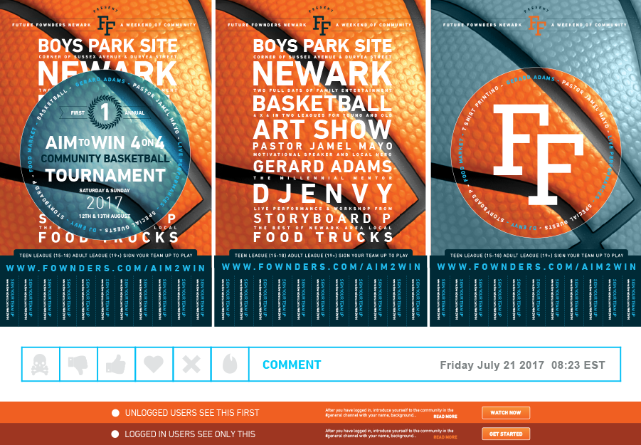
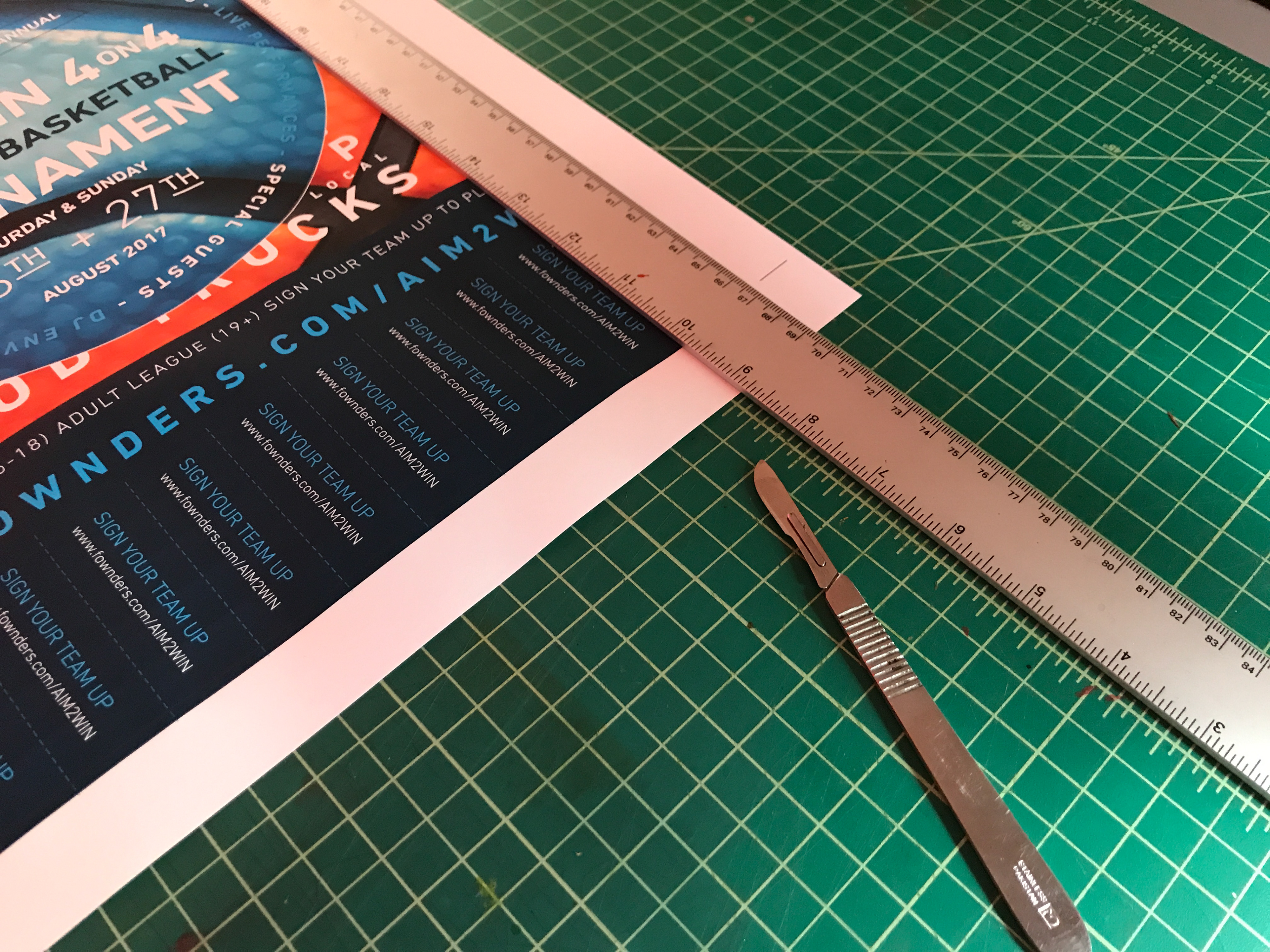
As a part of kicking off the workflows for content provision, I also created a loose sub-brand and set of posters and fliers for an event that fownders was running locally, and used it as an educational tool for creating workflow around booking events, printing, merchandise, etc.
This also involved creating a switchable folder of print assets for local sponsorshop drives etc.


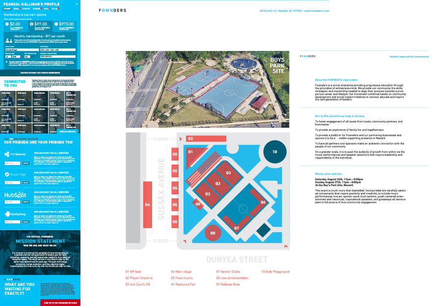
Runinng through a full event prduction was a great learning experience and taugfht FOWNDERS a huge amount about their reach, capabilities and direction at the time: it also mkeant that when we got back to designing the social network we had a fast evolving sense of where it was going, and the simple templates really began to blossom:

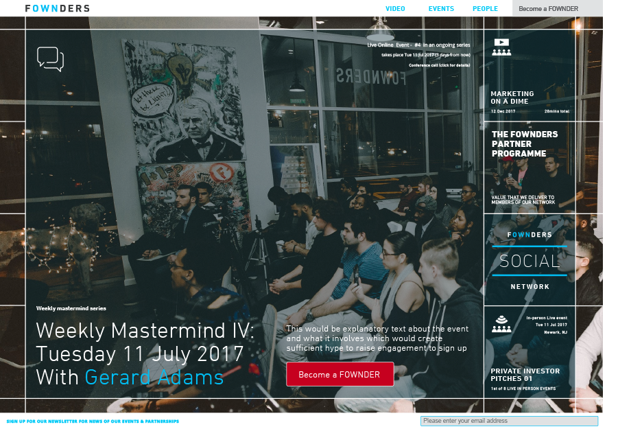

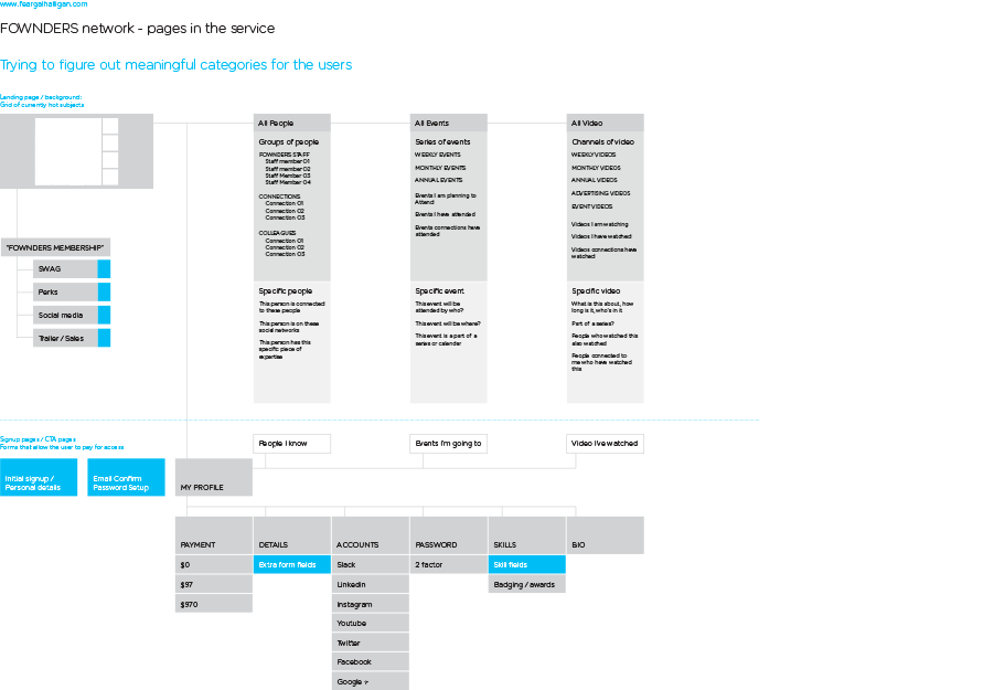
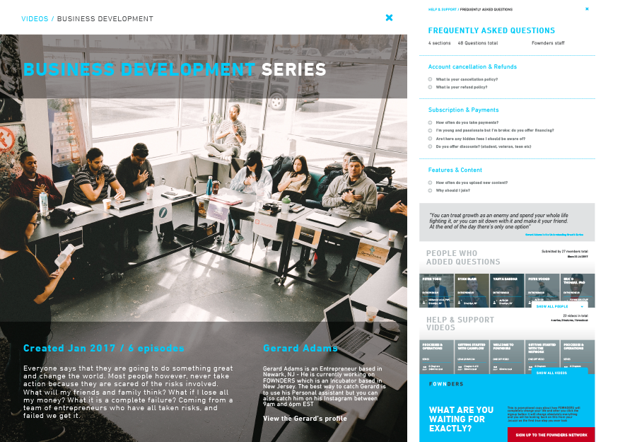
Once we took a look at the data and pooled opinions, the decision was made to mimic the central active social networks being used by our existing audience: in otherwords to provide network members with some Linkedin, broadcasters with a Youtube and advertisers with a facebook. This involved some hard pivots in terms of what the UI would deliver as can be see here:


By the time we had reached the end of the three month contract, the entire focus of the publishing team I had mentored was with meeting user demands for functionality that replicated regular social networking services - they had a healthy iterative cycle of design and build and were budy broadening the capability of the team prior to a massive push to expand the network.