TL; DR - A year's consultancy with a white label education provider to completely redesign their interactive student support service from the ground up; Full discovery, user research, service planning and the delivery of a full UI which evolved very quickly from advanced fast wireframe prototypes to eventually become a fully fledged UI. Light UAT and documentation throughout conducted by me.
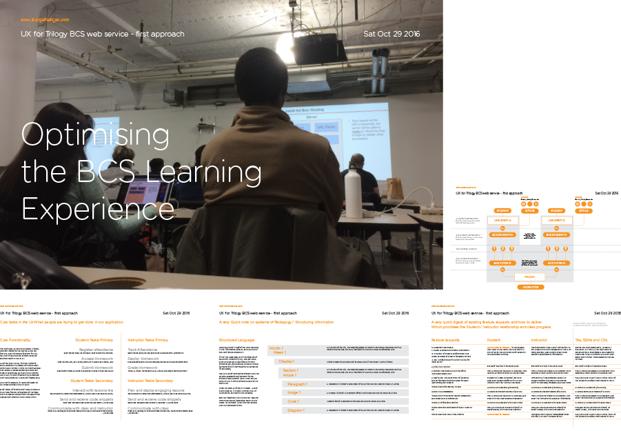
Trilogy Education were referred to me in late 2016 by an e-learning client - based in Manhattan they are a very well financed educational startup who at the time had been using a basic admin system called BootCamp Spot (BCS) to act as a back end admin and a front end learning platform for their students:
Working with Rutgers, University of Florida, University of East Texas and a host of other large third level instituitions, Trilogy had been running extensive live classes and refining both its curriculum and its userbase with no UX or UCD input whatsoever: I was hired in as a consultant to both act as their UX resource but also educate inside the organisation as to the value / ROI of UCD best practices.
Working with Rutgers, University of Florida, University of East Texas and a host of other large third level instituitions, Trilogy had been running extensive live classes and refining both its curriculum and its userbase with no UX or UCD input whatsoever: I was hired in as a consultant to both act as their UX resource but also educate inside the organisation as to the value / ROI of UCD best practices.
First steps were a process of problem presentation meetings and a series of stakeholder interviews with people throughout the organisation to set up tasks and user journeys for the new application. The findings of these conversations plus my proposals for the product were assembled together into a full report after three weeks -

Once the Presentation had been made, the contract was signed and I started a series of visits to the Rutgers bootcamps, interviewing students and lecturers and generally getting a "feel" for the project and what the main user needs / goals were
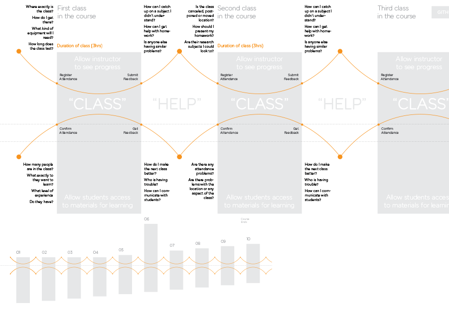
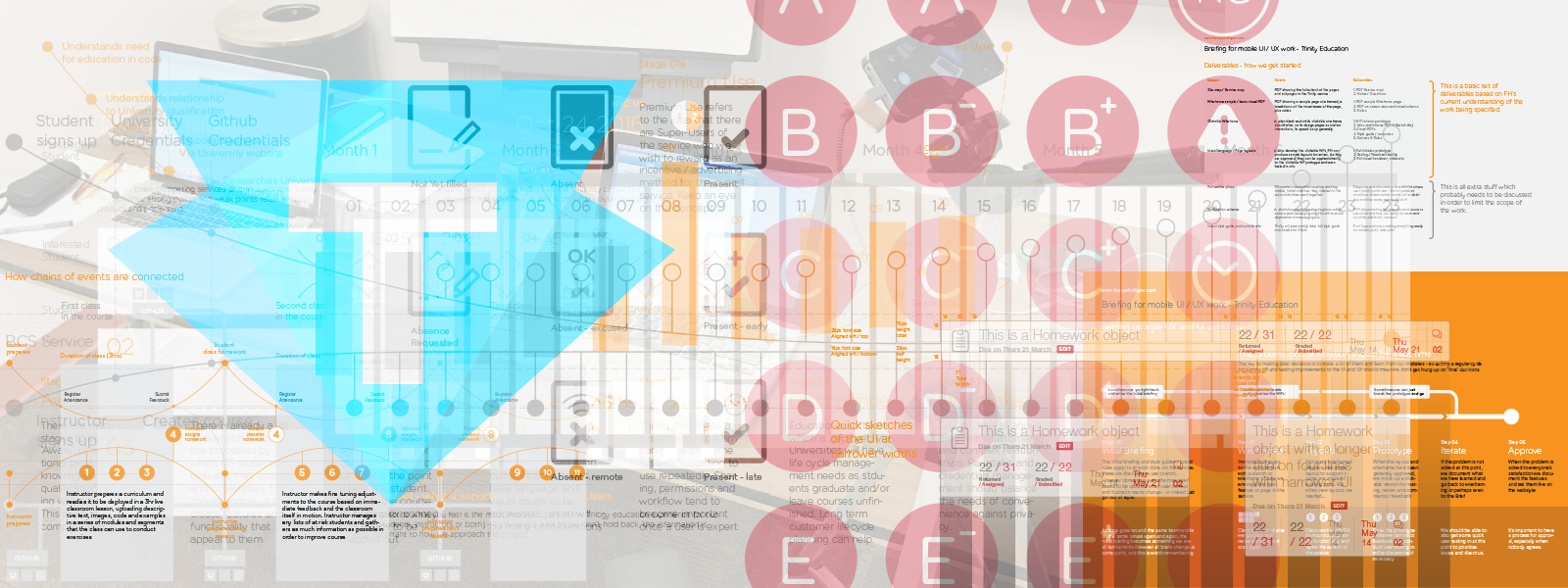
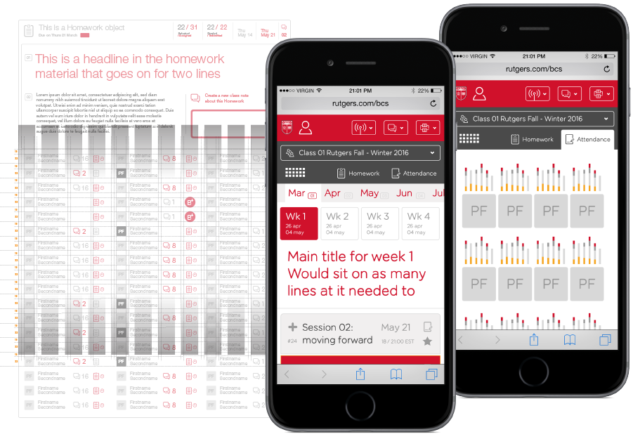
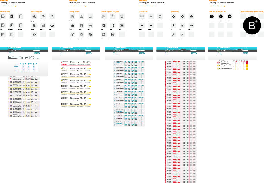
I then began an extremely fast-paced Wireframing process, where the WFs were in color and presented as interaction mockups via invision:
The idea was to present one set of rough, 12 month-going-forward interaction proposals and then refine these features into an MVP as quickly as possible. These two mockups were therefore presented and sent out for approval / feedback:
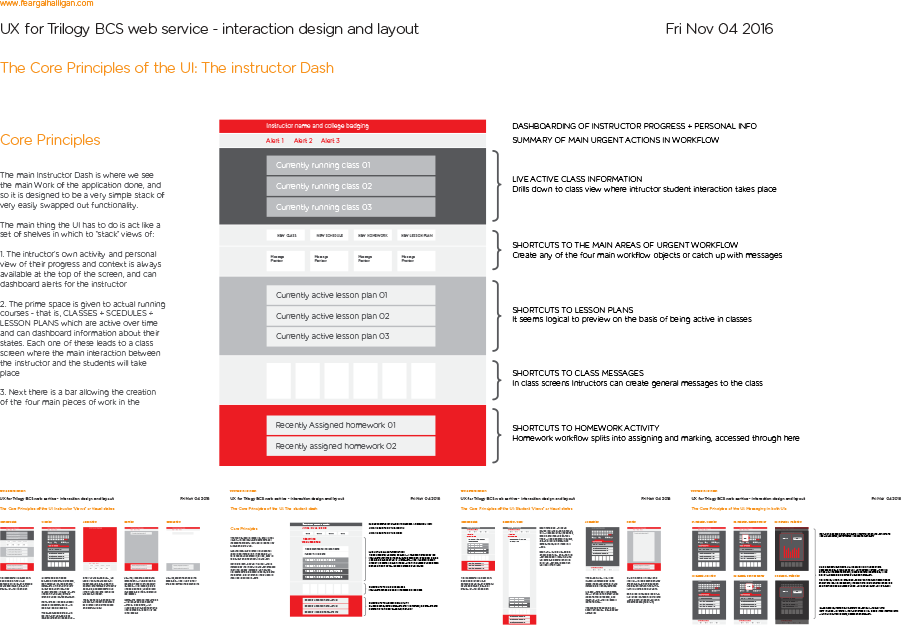
Prototype 01: advanced wireframe / interaction sample
This prototype was based on the Rutgers colors and intended to explore as much conceptual UI as possible - it was used to present the basic idea to the Trilogy Product Team for approval and generate a feedback cycle.
Prototype 01a: quick sketch of admin processes
This prototype was based on the Rutgers colors and intended to explore as much conceptual UI as possible - it was used to present the basic idea to the Trilogy Product Team for approval and generate a feedback cycle.
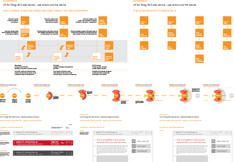
These prototypes meant that we could get a green light in principle on the broader aspects of how the UI would look and feel, but take advantage of the company processing time to conduct fast UAT tests on the students in the existing courses. These UAT tests took the form of in-person laptop testing with basic tasks such as "login to service", "mark self present for class" and "Submit homework"
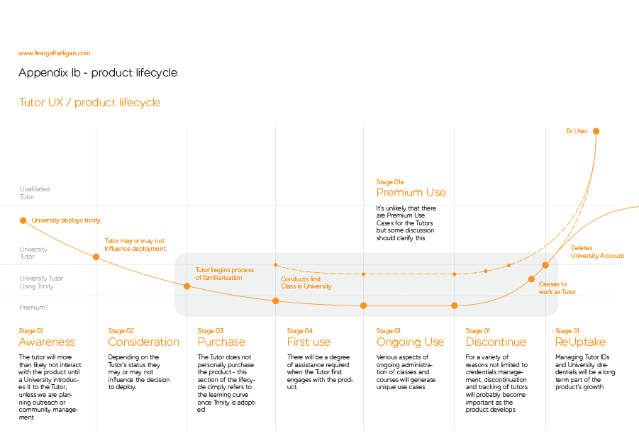
The testing prototypes took the form of a "first use" scenario and an "ongoing use" scenario, to best demo features that change between use contexts:
The testing prototypes took the form of a "first use" scenario and an "ongoing use" scenario, to best demo features that change between use contexts:
Prototype 02: First use scenario for testing
Prototype 03: Ongoing use scenario for testing
Test sample 01: uploaded video of UAT with test subject Will
Test sample 01: uploaded video of UAT with test subject Will
With final artworks, style manuals and interaction prototypes handed over for v1, the product team then set to work building out the BCS UI based on already agreed architecture and screens. This gave us time to pivot our efforts towards designing talented.tech, the hiring service that was intended to work in combination with the white label training service.
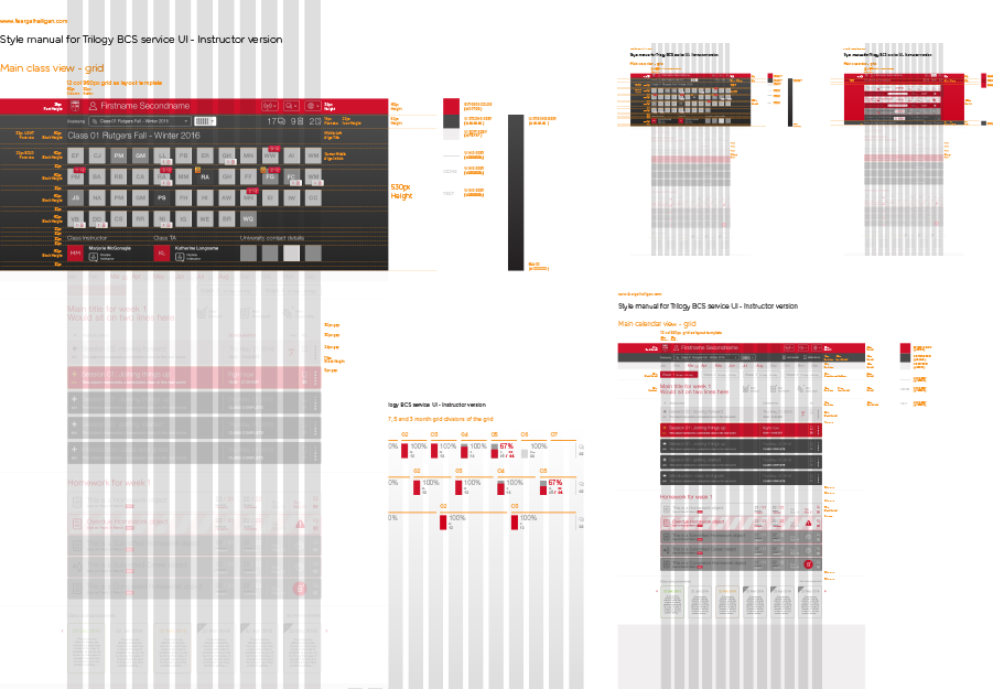
It also gave us time to refine the existing UI and generally tune things up:
It also gave us time to refine the existing UI and generally tune things up:
Prototype 09: main navigation only - for presentation
Testing Prototype 4: First time login / guiding the user through setup
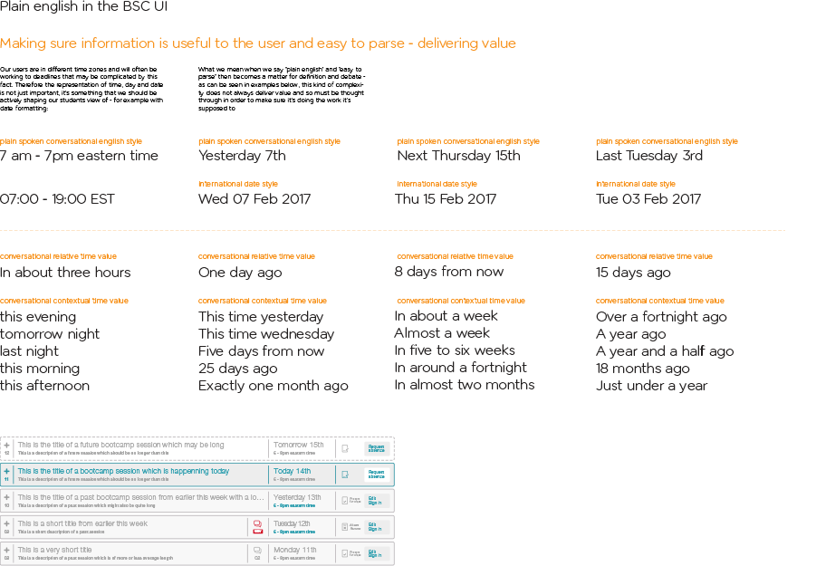
This prototype is intended to test a fresh user's ability to read their way into the workflow of the UI. It was intended both as a testing piece and a discussion / presentation piece about how the user learns the interface and how to minimise fail scenarios / support calls.
Testing prototype 5: returning login / badging / submitting a late homework
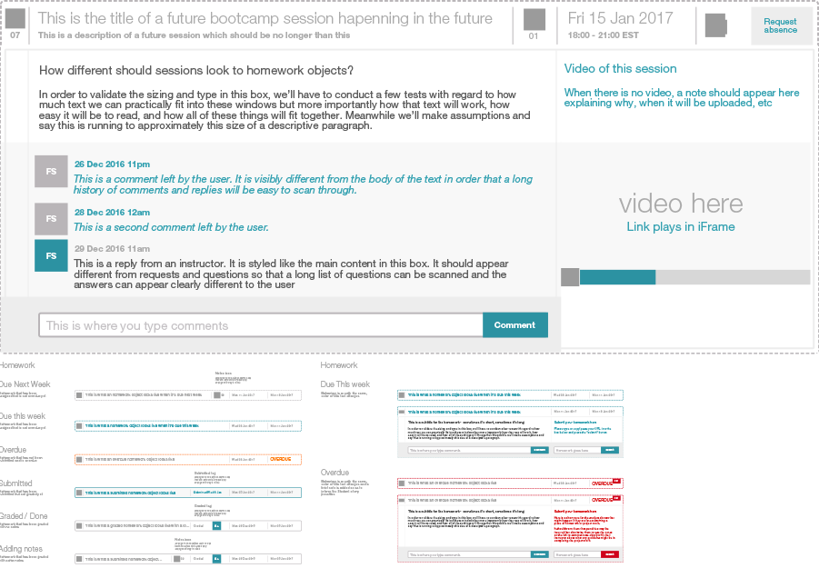
This prototype is intended to test a returning user's ability to "read" cues via badges in the UI and progressively understand how the software works rather than reading a how-to
The entire BCS / Trilogy education project continues to evolve and there was another huge piece of work around an employment advertising service planned in 2018 - this will be a separate entry in my portfolio but was a similar piece of large scale UI / UX carried out at a very fast pace and delivered in as agile as possible a mannner